Pantone Spring 2016 Color Report
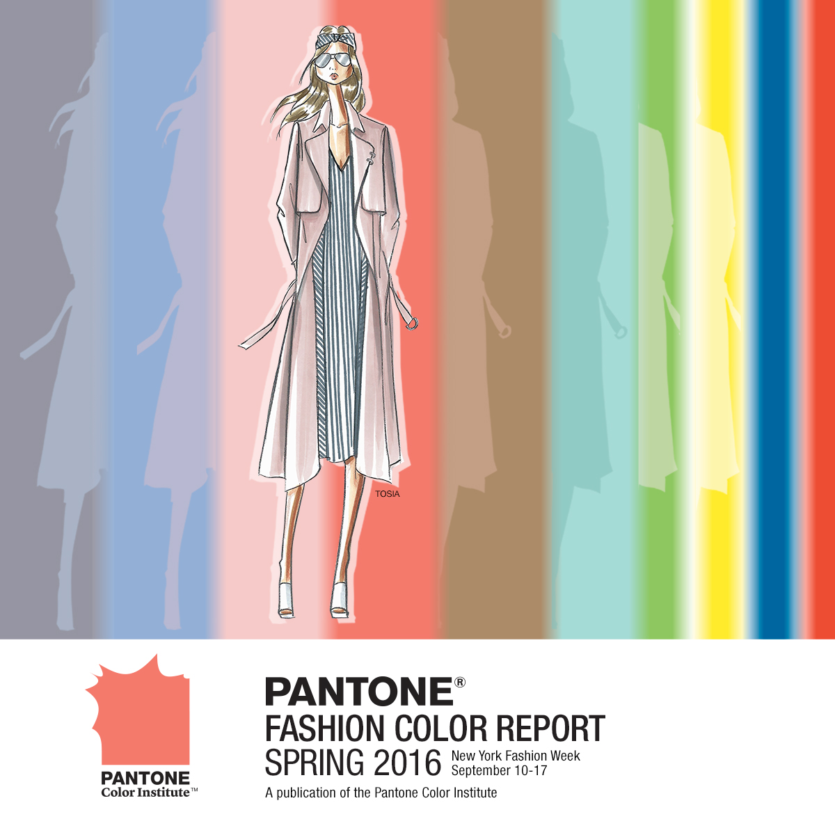
Spring 2016 is bringing out every color of the rainbow! Pantone is focusing on a 10-color unisex palette which translated on to the SS16 runways. I'm going to focus on 5 of these colors and how you can easily work them into your wardrobe for the coming season!
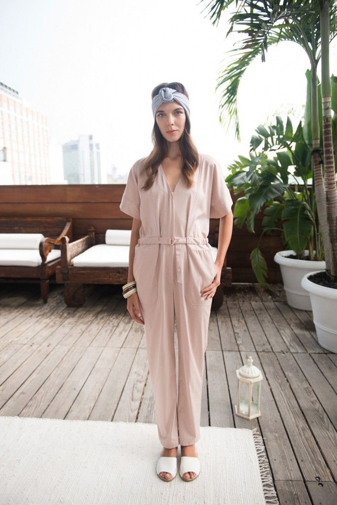
One of Pantone's "Color of the Year" colors, Rose Quartz is a beautiful blush pink, and one of my favorite colors. The shade is soft, lighthearted, and flattering on a wide array of skin tones. The shade was most prominently seen on the TOSIA and Charles Youssef
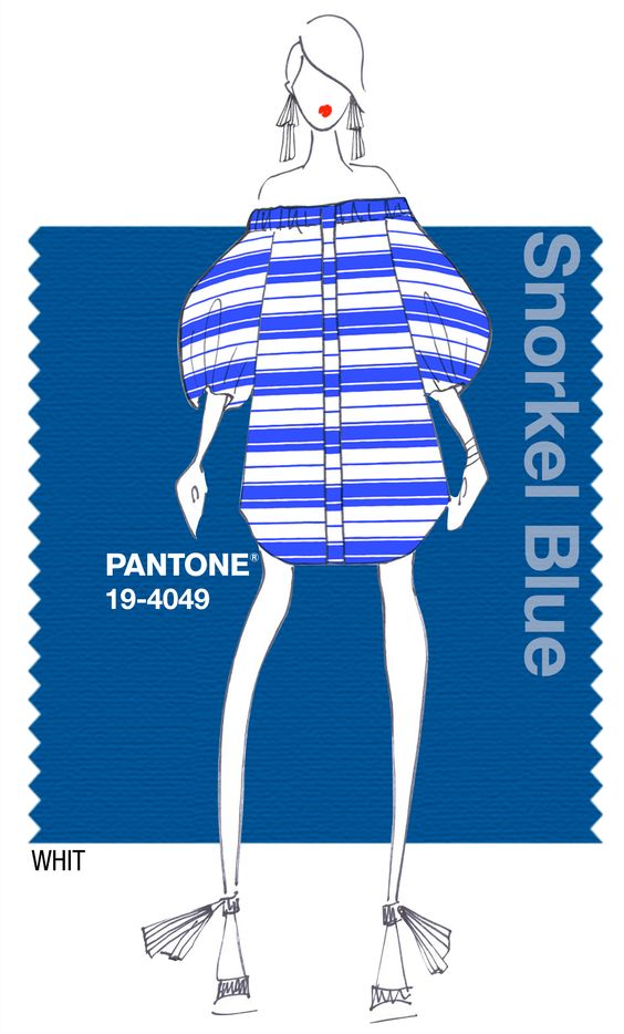
Snorkel Blue is a maritime-inspired blue from the navy family. It has a happier, more energetic feel to it, which makes it no surprise that WHIT NY was all about it this season.
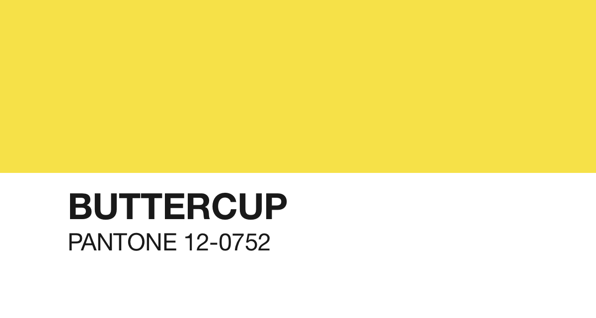
Yellow is back and brighter for this Spring! It's not everyone's favorite color, but don't be afraid of the vibrant hue. Take inspiration from David Hart and Charles & Ron this season and rock a pop of yellow!
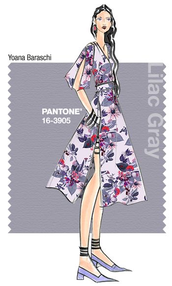
This subtle lilac-grey is the perfect spring neutral. Not too light, not too dark, it blends perfectly with lighter colors such as Rose Quartz and Buttercup for a sophisticated palette. Take inspiration from the runways of Yoana Baraschi and Rebecca Vallance this season and play up this hue in florals and lace!
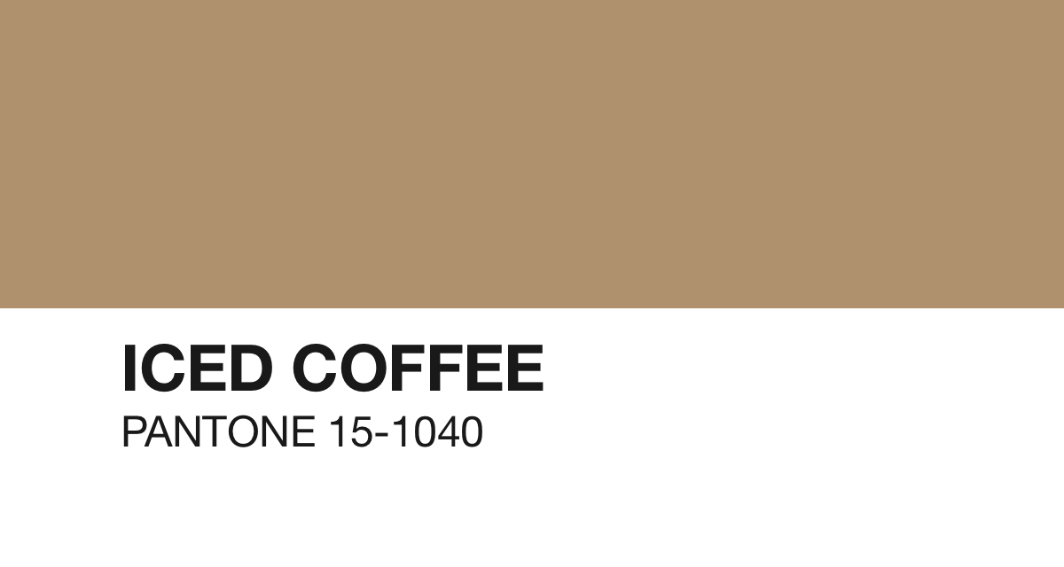
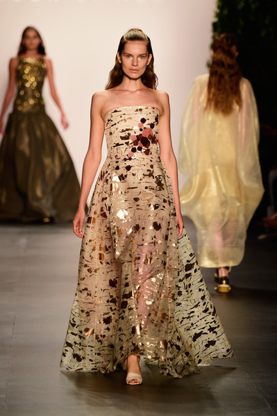
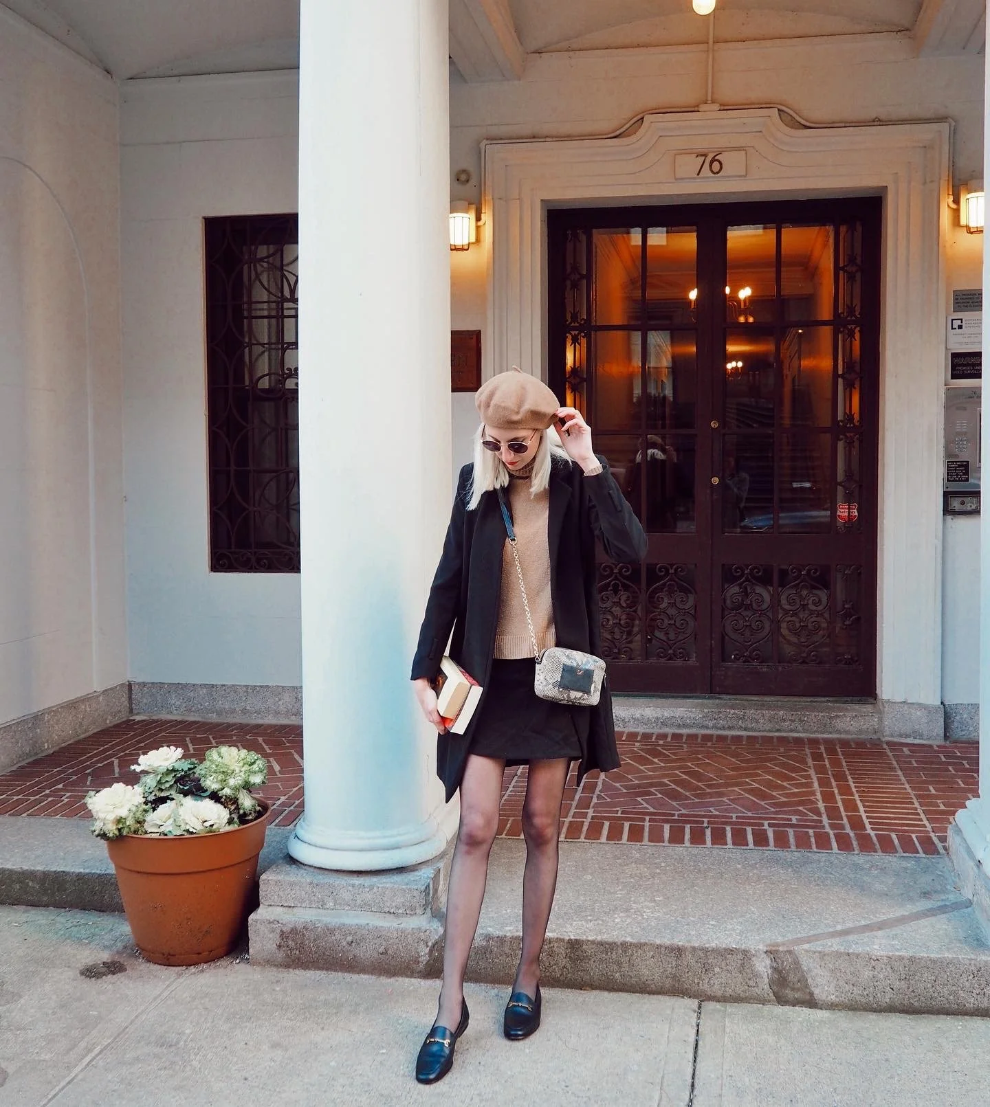
A subtle and earthy light brown that makes an excellent transition color through seasons. Pairs beautifully with Rose Quartz and Lilac Grey. Take cues from Noon by Noor and incorporate earthy pinks and metallics for a glam-bohemian vibe.


